Thursday, January 10, 2013

Art 1 Final Portfolio


 Art 1 final portfolio
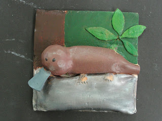
1.      I liked the clay tile project the most.  At first i didn't think it would be fun but after a while i started to enjoy it. It was fun molding the clay and making an animal pop out of the tile.  It was kind of hard using the Xacto knife to shape things and remembering to slip and score.  Also another thing that was tough was making everything hollow so it didn't explode after being fired. After you start painting it makes the tile look even cooler but it looks the best after the gloss coat is put on. Making the tile was time consuming but enjoyable. 

2.        I learned the most from the game drawing.  I learned how to draw things in perspective and make things look real.  I never knew how to draw things in perspective until now.  It also helped because we had to use stuff we learned earlier in the year for it.  We had to add value and shadows to the game pieces to make them look 3D and realistic.  I also learned how to find the horizon line to be able to draw in perspective.  We also had to put on washes of water color before coloring it in with colored pencils.  I learned a lot from this drawing and taking Art 1.
 3.        When doing the anamorphosis drawing we had to use skills that we had previously learned.  We had to use Photoshop to distort our images.  We had to transfer that image into our sketchbooks and then we had to add value.  We learned how to add value earlier in the year to make cubes, spheres and cones look 3D.  It was one thing that i enjoyed learning.  Knowing how to add perspective helps in so many different projects in art.  I never knew how to add value until i took art.  Everything you learn in art can be used in many different types of paintings and other things.


4.        The stencil was the project that was the least important.  All we did was turn an image of a landmark or transportation black and white.  Then we traced it onto a large piece of paper.  After that we just cut out all of the black so that we had a stencil.  Once we had our stencil we spray painted it onto a collage that we made.  We made the collage by pasting pictures and things on a piece of paper and then painting it with water color.  After that it was done.  I don't think that the skills learned are very useful at all because I will probably not use them for anything but for making another stencil.
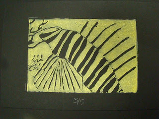
5.        I believe that my lion fish print most reflects
me as an artist.  I didn't enjoy making it.  It took a lot of time and effort to carve it out.  It also took a lot of time to draw it out, and eventually get it pasted onto the linoleum.  I also did it of one of my favorite animals and I really liked the final outcome.  Also i think that the colors i chose make it stand out more because it is light on dark.  This project wasn't one of my favorites but I liked how it turned out. It shows that i work hard and do the best that i can.


Friday, December 7, 2012

Perspective Game Drawing


I really like my final game drawing because it has great  color and it is really neat and well put together.  I blended the colors really good and i added good value along with shadows on the game pieces.  The water color really helped make some colors stand out and was a guideline when i was coloring it in with colored pencils for the final piece.  When adding water color to the drawing you really have to do it in very light washes of it so you can draw over it.

When drawing the outline you have to draw the lines going to the vanishing points which lie on the horizon so that the drawing is in perspective or else it wont turn out right.  I had to have the pieces overlap the board because it was on top of it.  When i was coloring in the game pieces i had to add highlights so that it looked 3D.

Mustang Stencil

1. Explain how you changed your photo in the lab to create a stencil.
In the lab we had to find an image of a famous landmark or transportation and then we took the image into photoshop.  Once we got the image into photoshop we had to change the threshold so the imagee was back and white.

2. When creating the collage background explain your choices of colors, materials (magazine paper, books pages, etc), and placement. How does it relate to your topic? If no relation discuss general idea.
I used pages out of magazines and i mostly used images of cars to make up the composition of my collage and i used all different colors on the background and did a blue and white border with spray paint.  I like how the colors blend really well together and it makes the mustang stand out more and there is good contrast between the car and the background.
3. Discuss the way positive and negative space was used to create your stencil.
We had to cut out the negative space on our stencil after tracing it onto the poster board using an Xacto knife and  then the negative space would be where there is no color and the positive space is what you  would spray paint.
4. When using the xacto knife, explain the safety procedures, how to use the knife and any challenges you had to overcome while cutting. 
You have to always cut away from yourself and you must always use a cutting board.  If there were any islands on the traced stencil then you had to connect them with another part of positive or negative space.
5. How was your experience with the spray paint? Discuss how color choice is important, placement of stencil, and any other concepts you noticed while creating this.
I think that the stencil has to be in the middle so that it is the first thing you notice when you see it and i liked the spray painting and it worked out well for my stencil.  The color of spray paint you chose has to stand out from the backgrounf to be successful.

Monday, November 26, 2012

Anamorphosis Drawing

Anamorphosis Drawing
1. Describe the process you went through to change your object into the correct perspective to create the drawing. This is when you were in the lab.
We had to put a picture of a small object into photoshop and then make the image larger and then widen the top of the image and then we printed out the image and transfered it into our sketchbooks.
2. How did distorting and stretching the object allow for you to create a drawing that would look different to the viewer?

The distorted image looks like it is stqanding up when you look at it from a certain angle and you have to add a shadow to make it look 3 dimensional and shade in the drawing.
3. What were the most important concepts in the project to make it successful?

You have to add a shadow so that it looks like the object is standing up on a surface and shade correctly so that it looks three dimensional and transfer it properly.

Monday, October 22, 2012

Lionfish Print

1.     Describe the overall composition of your artwork (balance, unity, rhythm and movement).
I think that the positive and negative space really balanced out.  The colors worked really well together and it looked really well in the end.

2.     How did you add texture and contrast to your print? Is this important? Why?
I added the texture by making big and small lines in the print and i added contrast by amking most of the fish black and the background being yellow.  It is important so that your main image can stand out and it makes it look more realistic.

3.     Explain how you used positive and negative space to show your image.
I surrounded the fish with a black line and used a lot of negative space in the fish and a lot of positive space in the background.  The fish really stood out because of the contrast between negative and positve space.

4.     Describe the craftsmanship of your print. (How good the project is technically crafted)
dI think that i did really well on the carving of the lenolium.  I got thick and thin lines in my fish and the lines were deep and all cut as best as i could.

5.     Were you able to achieve depth by showing a foreground, middle ground and back- ground? Explain.
Not really, i only had a little bit of coral in the background and it does not really achieve a middle or back-ground for the print.

6.     Explain your experience with Printmaking. What were the obstacles and advantages?
You have to make sure that you dont mess up while you are cutting because you cant fix it and if you use to much ink it will ruin your entire print.  Some advantages are that you have five prints to get it right so if one messes up you are still good.

Thursday, October 4, 2012

Interactive Chalk Mural

1. Explain your experience working on a team and executing your ideas for the mural.
Most of the time everyone in the group was working and contributing and working in a group was easy and you get a lot done when you have multiple people working on the same thing.
2. Explain the importance of collaboration when working on a team.
You have to work as a team so that you can get things done and so you can get everyones opinions on the work so you can do better.
3.  How successful was this project? Explain how and why.
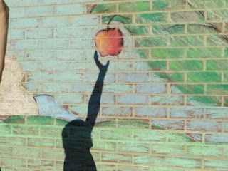
It was pretty successful and i think it turned out good.  The blending with the chalk worked well and using the pastels to add in dark colors made our tree look more realistic.
4. Explain how you feel about creating artwork that others can interact with. Ex. Invoving the whole school?
I liked working on the interactive chalk because it'soldrtg cool how people can look like they are a part of it and how people can interact with it and they dont even know it.

Art 1 Animal Sketch

1. Why is texture so important to have in your sketches?
So that you can give an amial fur in a sketch or so you can make it stand out from the flat surfaces of the sketch.

2. Why is it neccessary for you to have several references of each animal and each background? Explain.
It is necessary because you need to make sure you can get all the details and you can put more things into your background.
3. When you look at your sketches are you able to see which sketch is the strongest and will make the best print? How do you know this? 
Yes, i look at which one has the most contrast and the best texture and i look at how well the animal is drawn.